


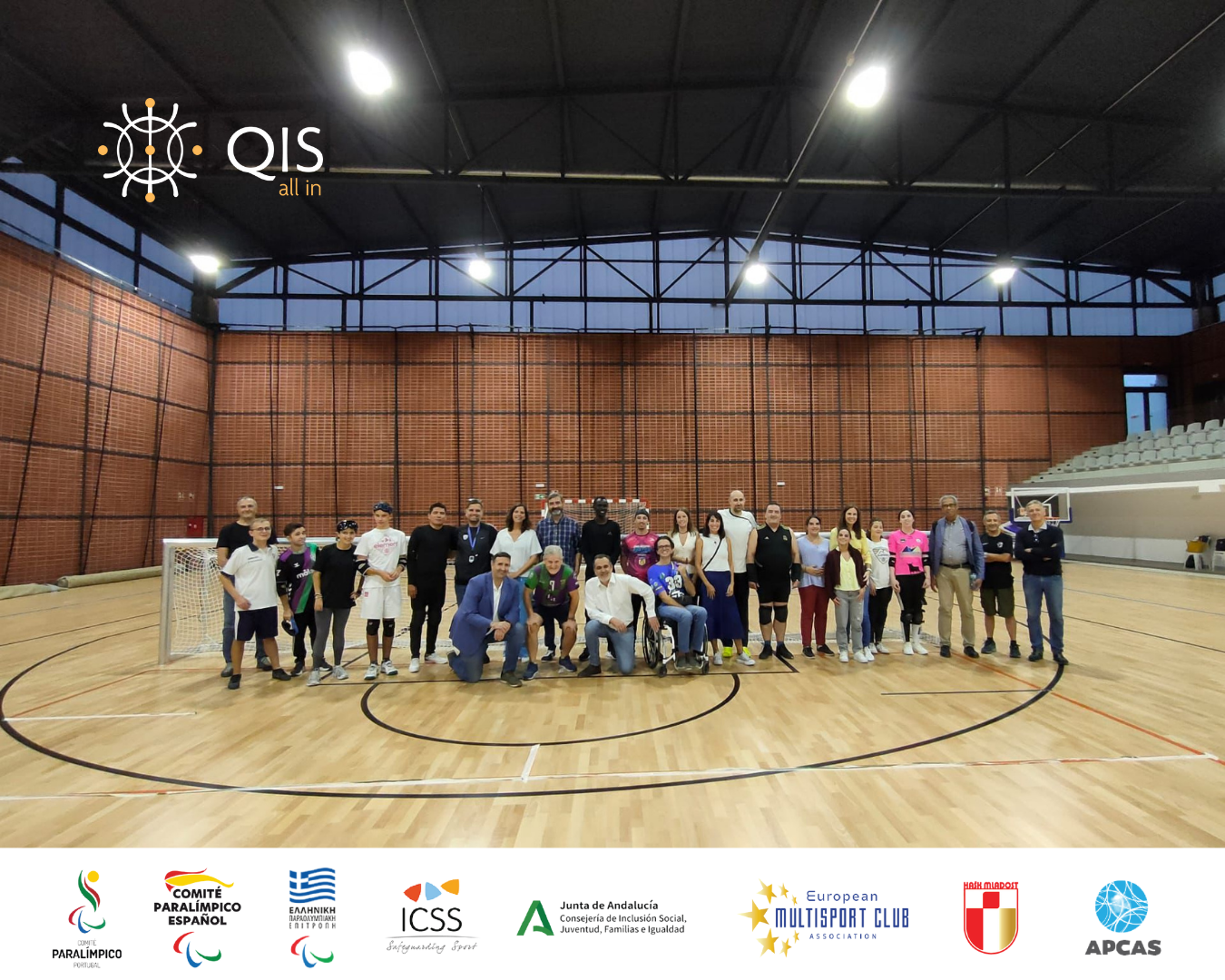
QIS – All In Transnational Project Meeting in Málaga
QIS – All In Transnational Project Meeting in Málaga Experiencing accessibility, inclusion and sport in practice In mid-October, partners of the QIS – All In
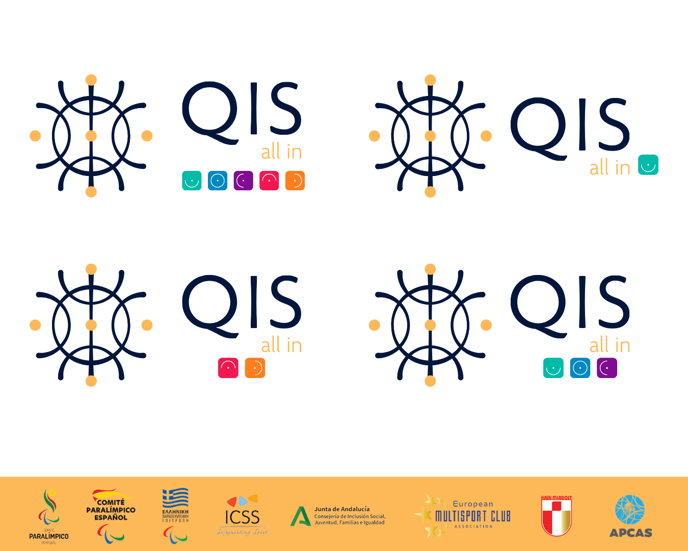
Logo that reflects inclusion by design
Logo that reflects inclusion by design The QIS – All In logo is not just a visual mark, it is a statement.A statement about how
The QIS – All In project website is live
The QIS – All In project website is live A digital home for accessible, inclusive sport in Europe. We’re excited to share an important milestone
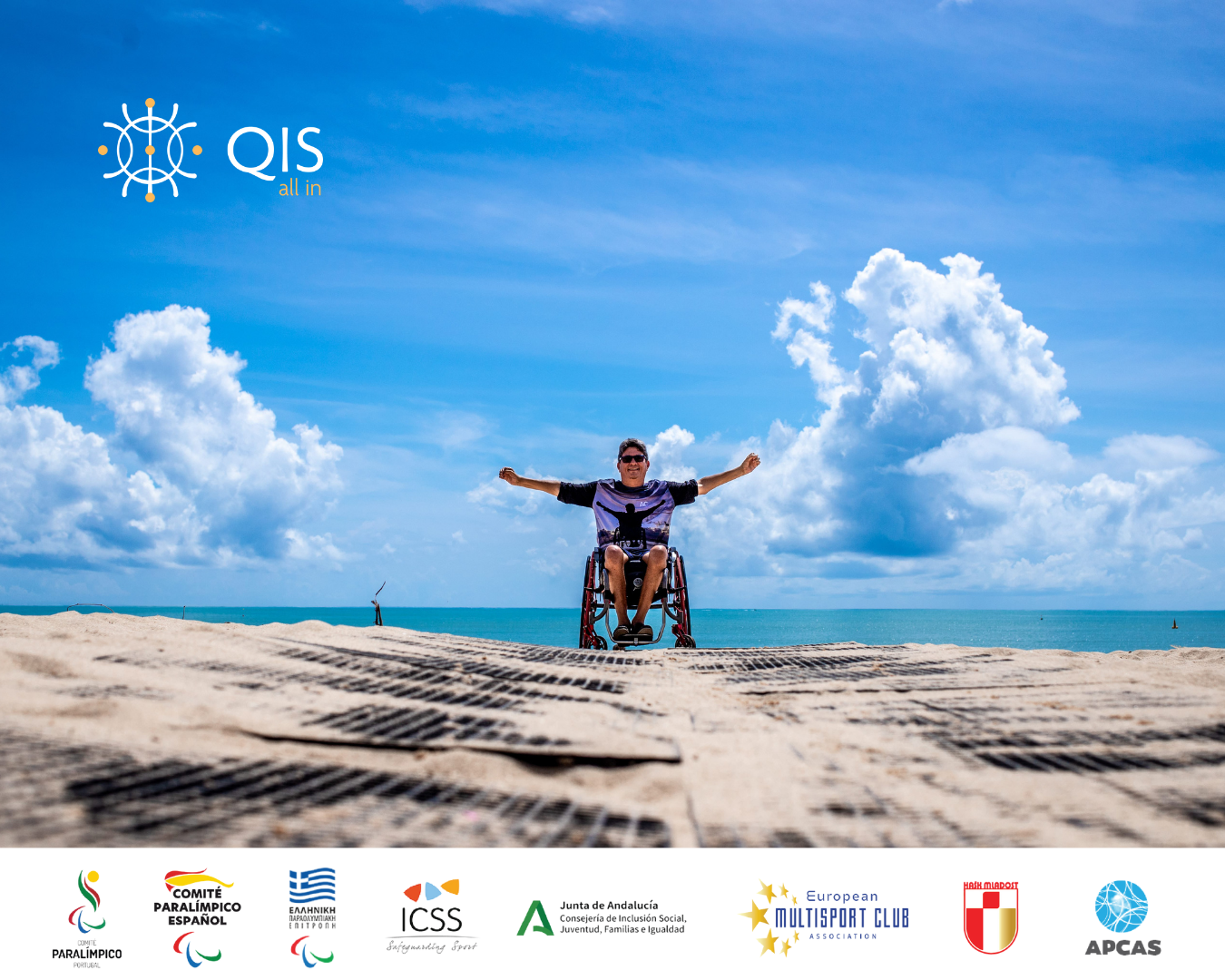
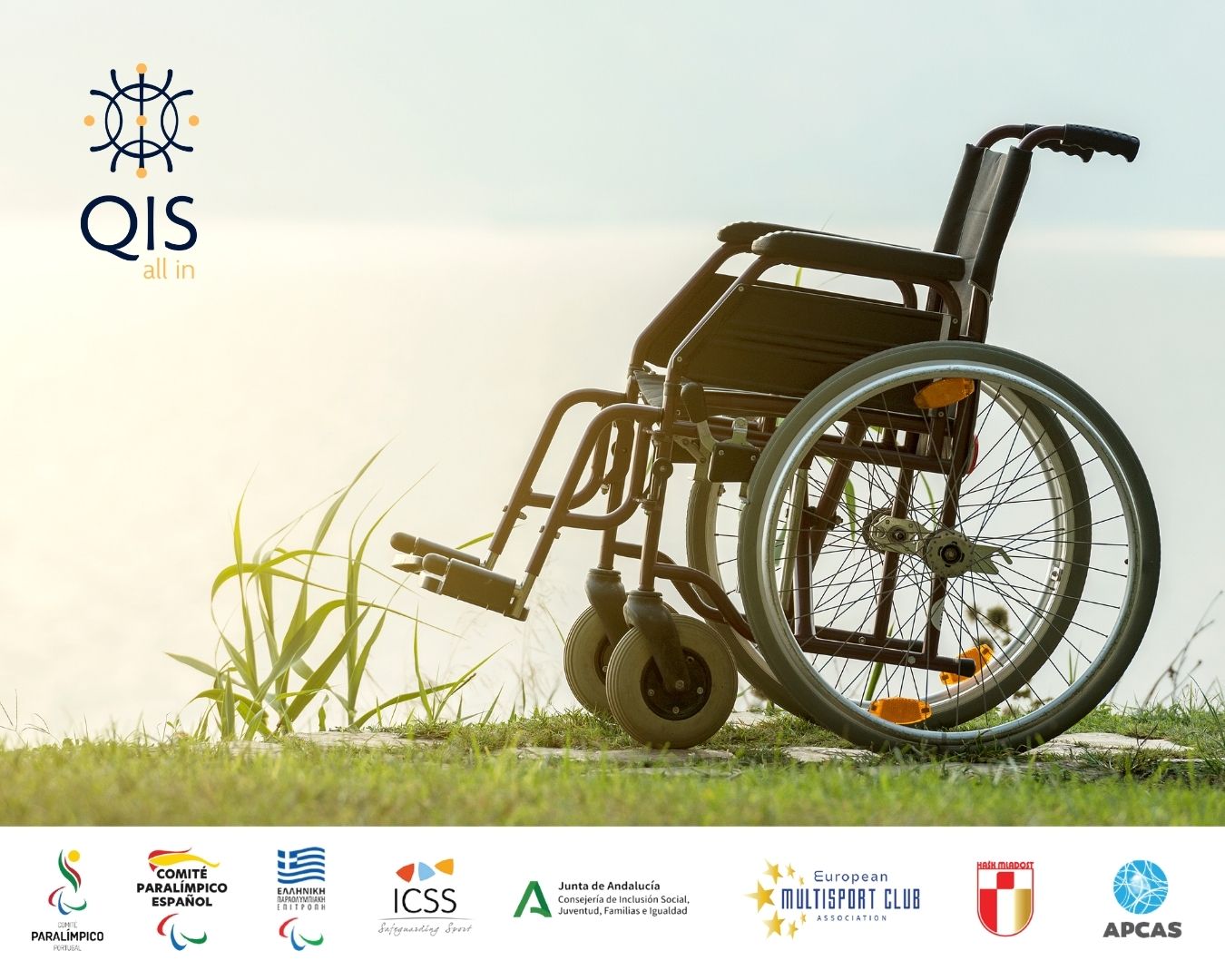
Why this project matters
Why this project matters Because too many people are still left standing at the door. We could talk about accessibility in numbers — and they
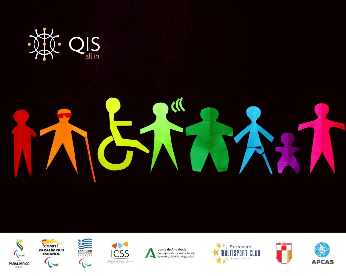
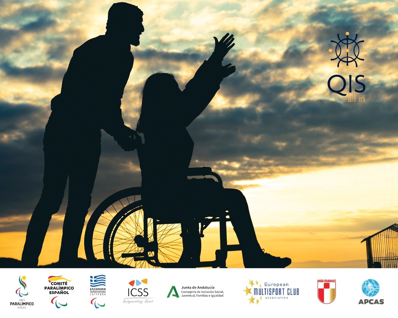
Introduction to the QIS – All In project
Introduction to the QIS – All In project Sport for all. Quality without barriers. If you’ve ever stood in front of a sports facility and
QIS in Practice: People, Partners and the Stories Behind the Work
QIS in Practice: People, Partners and the Stories Behind the Work How Europe is coming together to build a new standard for accessible sport. On